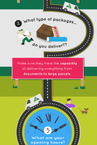
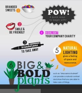
 Information graphics or ‘infographics’ as they are commonly referred to, are a great way to amplify and represent data and/or information in a visually exciting and interesting way.
Here, I am going to be outlining the key factors which can help you make your very own awesome infographics.
(A heads up though: To create infographics similar to the ones mentioned in this article, you will need an intermediate amount of experience working within Adobe Illustrator or a similar design program).
Start out on paper
Before you dive straight into creating your infographic, I would advise creating a plan of how it’ll look from top to bottom on a sheet of plain paper. This not only helps you avoid making any design mistakes later on but can also help to get your creative juices flowing!
Decide on the theme
Now that you have decided on the perfect layout for your infographic, it’s time to decide on its theme.
Your theme depends on your infographic’s topic. If the topic was recycling for example, you might think that it would be best to stick to shades of green to promote the idea of a clean environment.
Another example is if your infographic was about travel you might think that in terms of colour, it would be quite varied, but in terms of its overall theme, you might envision it to be full of engaging graphics of roads, cities and vehicles.

Consistency or Adventurous?
Will your infographic be consistent and clean (think Apple) or engaging and adventurous (think Fanta)?
This is something to think about from the beginning and to remember sticking to through to its completion. However, there are some parts of your infographic which should remain the same throughout.
The distance between elements in your design is an example of this. I would also advise not to use too many different fonts, as some go a little overboard here – so much so it’s difficult to follow.
Do not rush
It is easy to speed through an infographic section to section, especially if the copy you are using is numbered or ordered in a particular way. However, this is likely to set you back rather than forward.
Unless you spend time experimenting and putting thought into every section of your infographic, it just won’t flow and you’re likely to end up having to go back to it later and revamp it.
The best infographics follow a kind of ‘pattern’ or ‘story’ which guides the reader through an interesting and visually beautiful experience.

Infographics should…
- Be colourful!
- Be well-organised but not plain
- Be vector based – not pixels i.e. not photographic
- Have a noticeable flow or pattern to allow the reader to easily interact with it
Extra pointers…
- Does the infographic need to be branded? If so, stick with the company’s colours and fonts.
- Understand the content from the provider – can changes be made to the infographic’s copy to fit the infographic? Some clients may not allow this.
Now you have all you need to know to get out there and create a great infographic! Good luck!
