Web design trends are one of the easiest ways of identifying a website that’s in need of a refresh. We recommend that companies rebuild their website every three years, mainly for functional purposes and the user experience. However, think about it from the point of view of a consumer – if you click on a website that hasn’t been updated design-wise recently, you instinctively know it’s old. What does that do to your perception of that brand? So the design of a website is more important than you may think. If you are about to start work building a new one, it would be useful to know what the web design trends in 2020 will be.
Layers and soft shadows
Similar to the trends in graphic design, overlapping shapes, typography, graphics and photos are also gaining increasing popularity in web design, and are certain to be a big hit this decade. This technique creates the kind of depth and intentional imperfection that gives personality to the design. In addition, soft shadows can further emphasise this layered approach and enhance the feeling of depth.
3D interactive elements
With technology evolving, moving away from 2D design will be a big trend in 2020. 3D elements are now taking centre stage with interactive features, which makes websites seem more like video games rather than static scrolling pages of text and images. These rich experiences are engaging and enticing users to return to the website, helping to turn them into fans of your brand and much more likely to become customers or clients.
Transitions and motion
Motion attracts the eye and provokes interest – it’s our natural instinct to react to movement. Humans are mesmerised by moving objects, whether it’s flames dancing on a log fire, waves crashing against the seashore, or elements on a screen sliding around. Whatever it is, we simply enjoy watching the movement. However, website designers need to be aware that sporadic and unharmonious motion can have the opposite effect, causing people to click away from your website, so finding the perfect balance is key. Smooth transitions and tasteful animation can make visiting your website a treat for the eyes, compelling people to look further for more hypnotic eye candy!
Background videos
Although this has been a strong trend for the past few years, it continues to hold its ground – indeed, it is getting more popular. These kinds of videos do not usually have sound unless the user specifically enables it, and they’re very short (10-30 seconds). Their main purpose is to compliment your website’s design by being fairly simple and not distracting the user from the content. You would usually find such videos as large home page headers (like the one we use on our own website), behind bold typography, menus or call to action buttons. Compressing these videos correctly for the web will drastically improve your site speed, so don’t neglect this.
Voice and chat
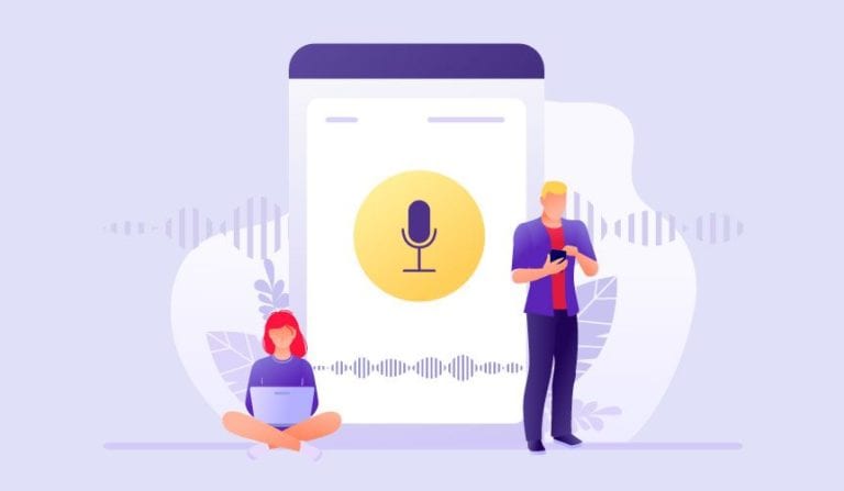
Providing accessibility on websites for people with disabilities is improving each year. There’s no reason why we shouldn’t be able to cater to everyone and hopefully, 2020 will be the year we make some real headway. However, its purpose is not only for helping people with disabilities. The possibilities stretch beyond this, for example, to enable more instant hands-free responses to questions and requests. Alexa, will we be able to speak to websites in the future? I haven’t tested this, but I think her response would be something like… “Duh!”. Good UI and UX design will be central to how voice and chat functionality integrates into websites seamlessly.
